
Ui/Ux Decisions on PrepMyWeek
- Benjamin Farthing
- Jul 2
- 1 min read

When building a full-stack app, it's easy to focus entirely on functionality, but I knew from the start that a clear, intuitive user experience was key to making PrepMyWeek feel real and usable.
Here are some of the intentional UI/UX choices I made:
✅ Simple, consistent navigation
Whether logged in or not, the navbar is always visible. For logged-in users, the logo triggers the sidebar giving them access to their profile, their past preps and their added recipes. For guests, it links back to the homepage.
✅ Clear prep flow
After selecting a store, users are guided step-by-step: choose how many meals, pick recipes, and get a tailored grocery list. I used modals and prep progress tracking to keep users informed and on track.
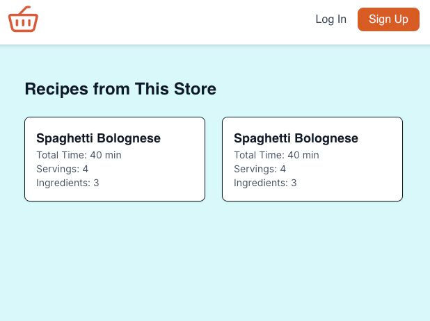
✅ Minimalist recipe cards
Each card shows exactly what you need to know at a glance: cook time, number of ingredients, average rating, no clutter.
✅ Accessible design
I kept contrast, font size, and tap targets in mind from the start, and made sure everything works well on both desktop and mobile.
UX isn’t just about looking good, it’s about making every interaction feel smooth and deliberate. Even in a capstone project, those little details matter.

Comments